Firesale
The marketplace of things right in your phone
TASK
Create a marketplace of things as a mobile app from the scratch. Also, create a full brand identity.
CLIENT
Startup with a willingness to create a simple and profitable way to trade anything. Mobile application for users to sell and buy whatever they want.
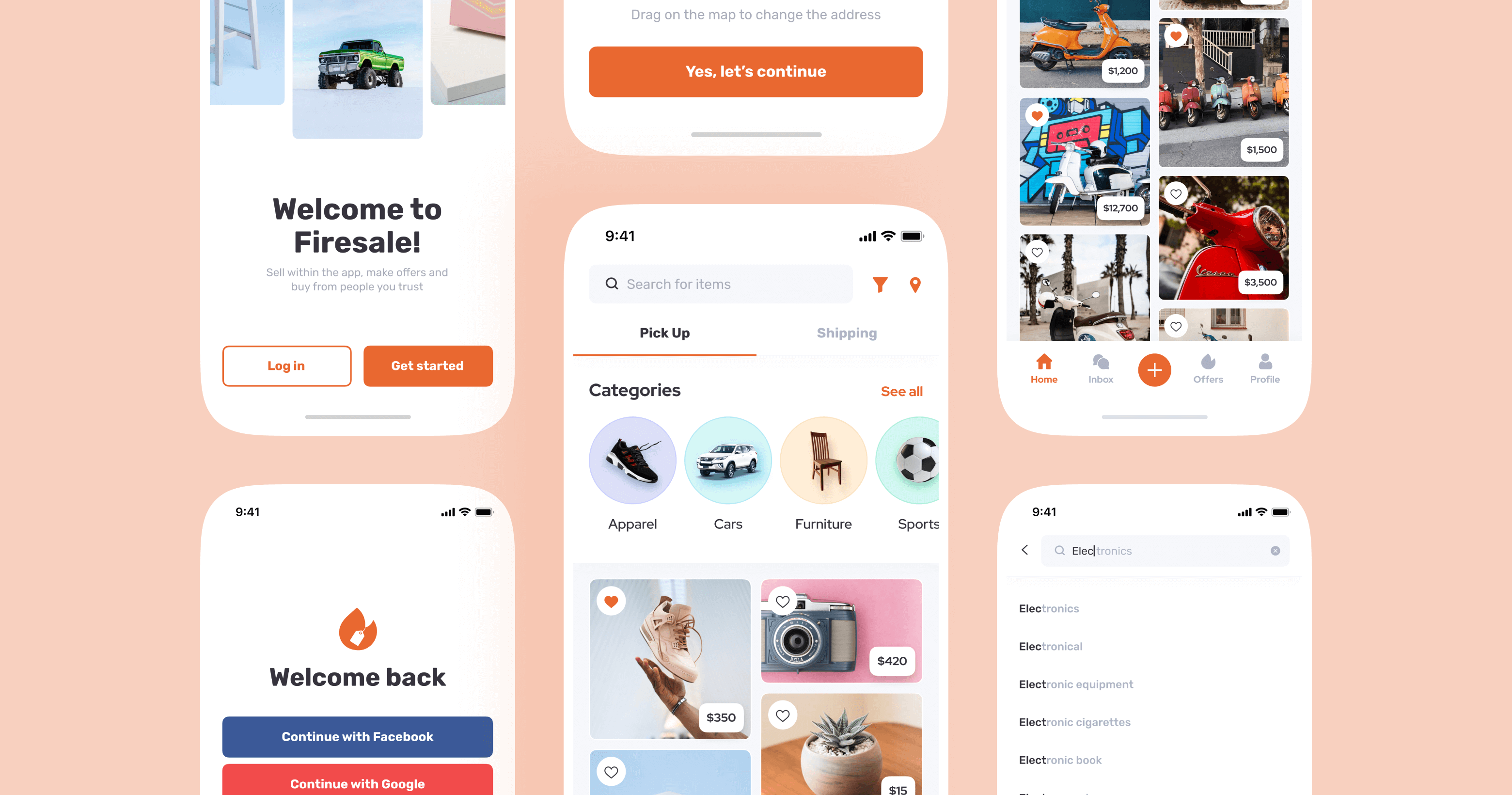
Bright and clean UI.
Genious UX.
How to show a great catalog of things easily in the mobile app? We’ve solved this issue with bright tiles and simple navigation through the app.
As we always do with brand new apps, this project started with UX research. User flows, screen map and well-built logic of the future app is a good base for the well-grounded design.
To make sure we work on the app client wants to receive, we’ve started UI design from the home screen. When the visual direction is approved, we proceeded to the most interesting part — the catalog.
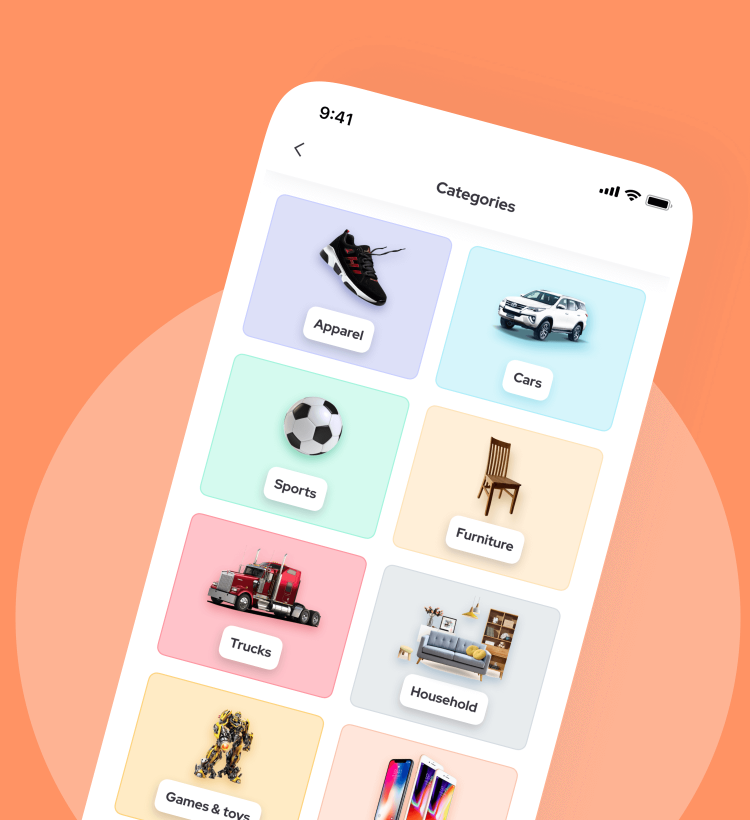

Sell well on Firesale
in a few clicks
To allow people to become best-sellers, we’ve broken a flow into 4 simple steps: choose pictures, add descriptions and details, set up the price, and choose terms for delivery!
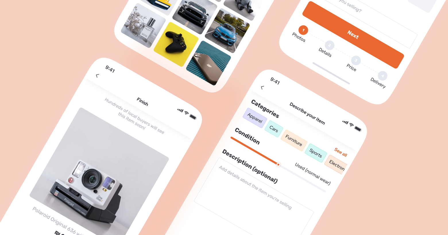
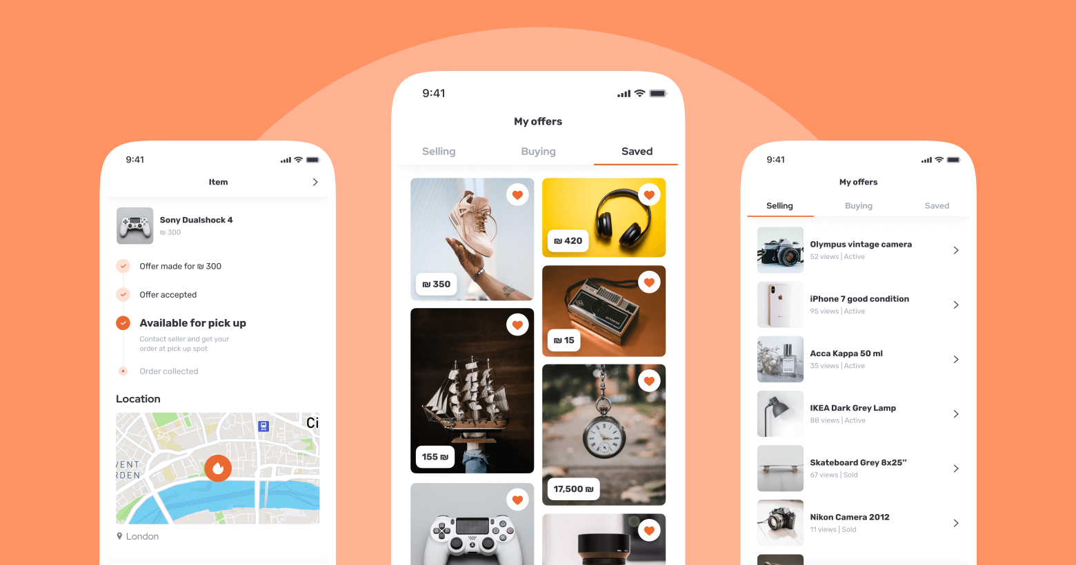
Make an order now or save for later.
Surfing through the catalog is one of the best parts of shopping. Of course, users can save items they liked in the profile.

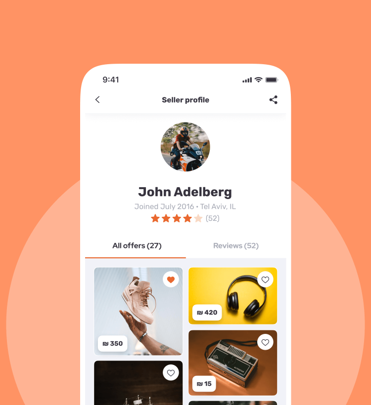
Buy from the trusted sellers and
chat directly in the app.
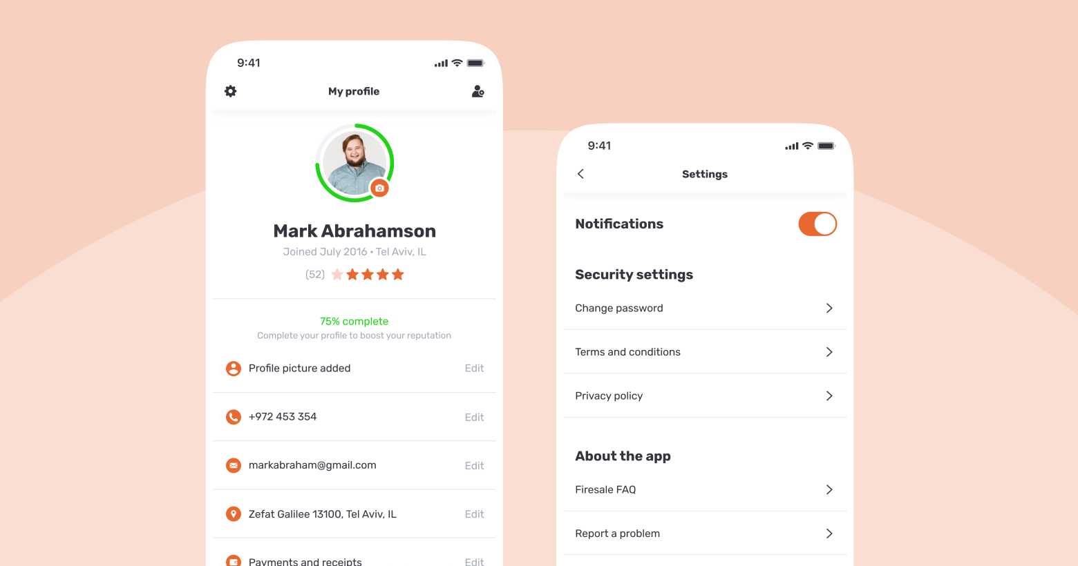


To make users maximally safe during the shopping, we’ve added an option to chat in the app and get receipts.
While registering on the profile, all sellers should add full contact information: email, phone number, and address.
Users can both get access to the contact info of sellers and save receipts, chat in the app to be completely sure they will get their order in time and condition they expected to get it. The history of orders will always show what the status of your order is.
Simple logo with a strong idea
Thinking on the branding ideas for a mobile app marketplace, we’ve decided to combine the name “Firesale” and a tag. So users get the right impression of the application from the very first glance.
