GrapheneCA
Corporate website for graphene-based products
TASK
Create the website and branding from the scratch. Also, work on the art-direction of photography and illustrations.
CLIENT
The new company, that produced building materials from graphene. Graphene is a material, that got the Noble award for its magic characteristics.
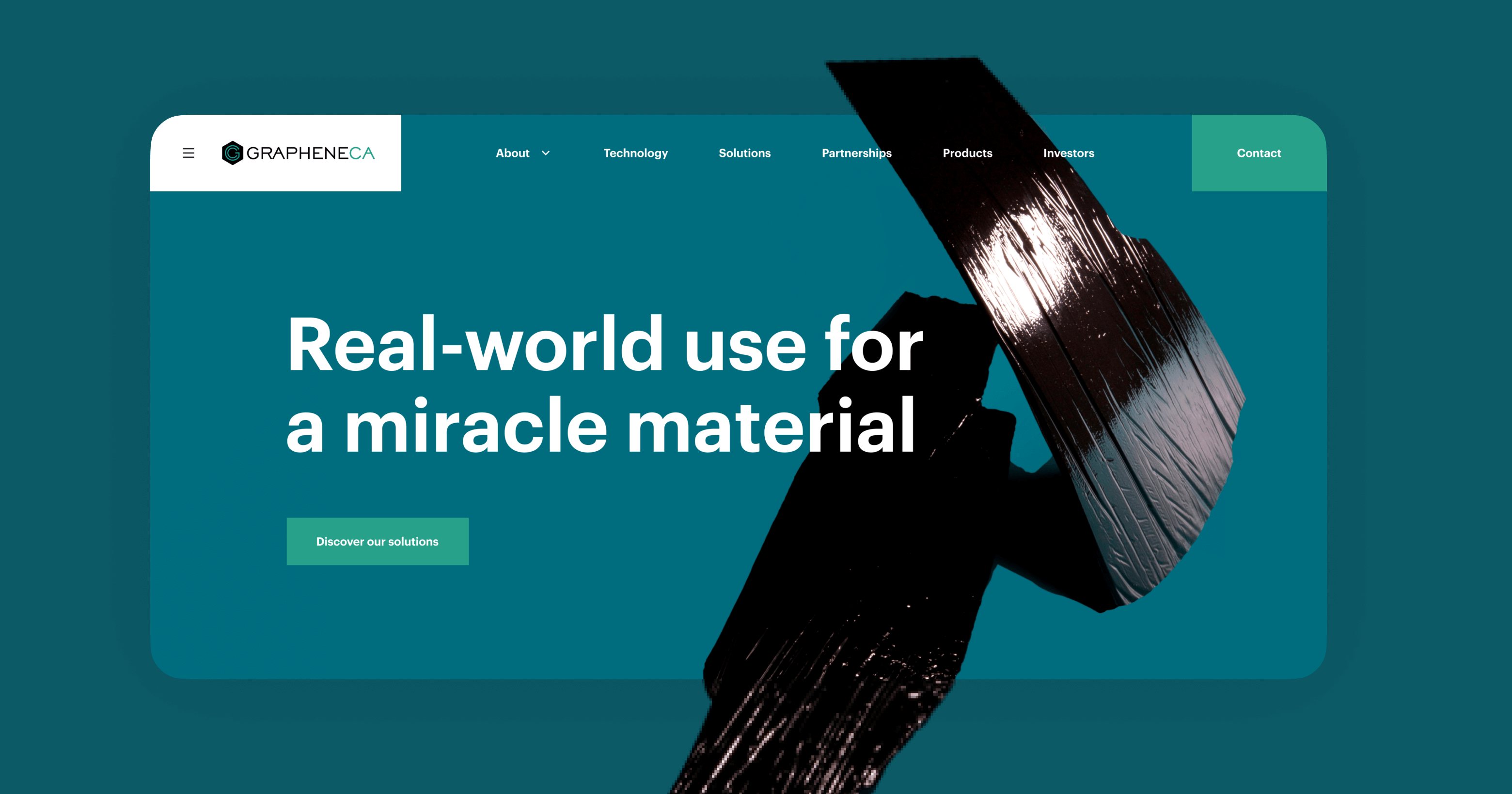
Fresh design for an innovative construction solution.
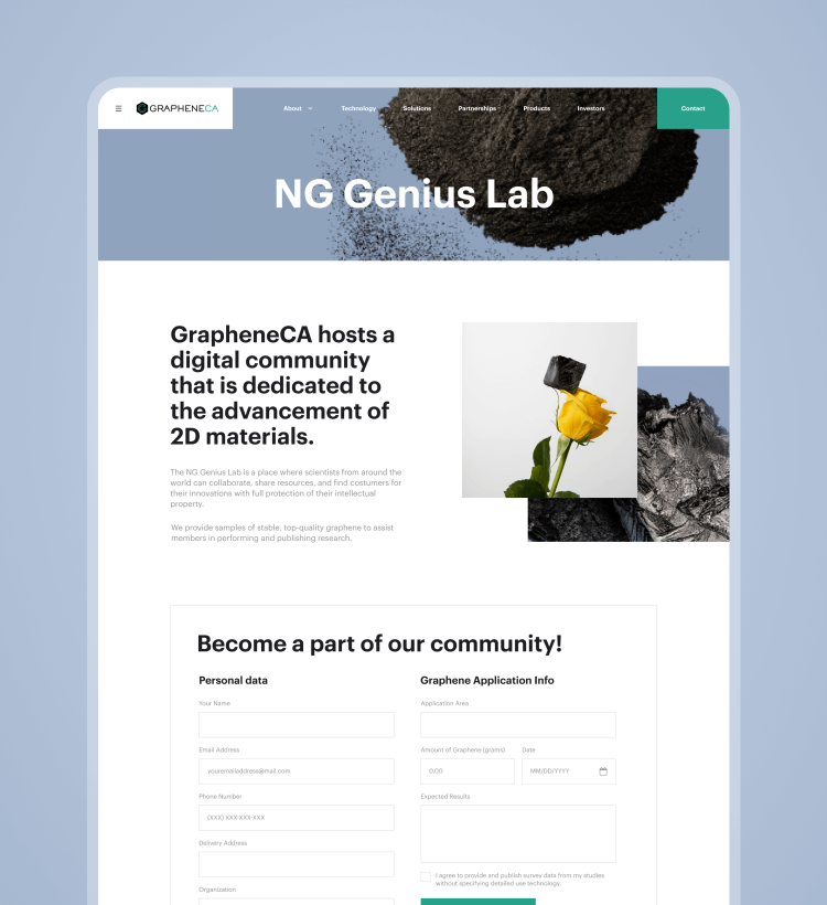
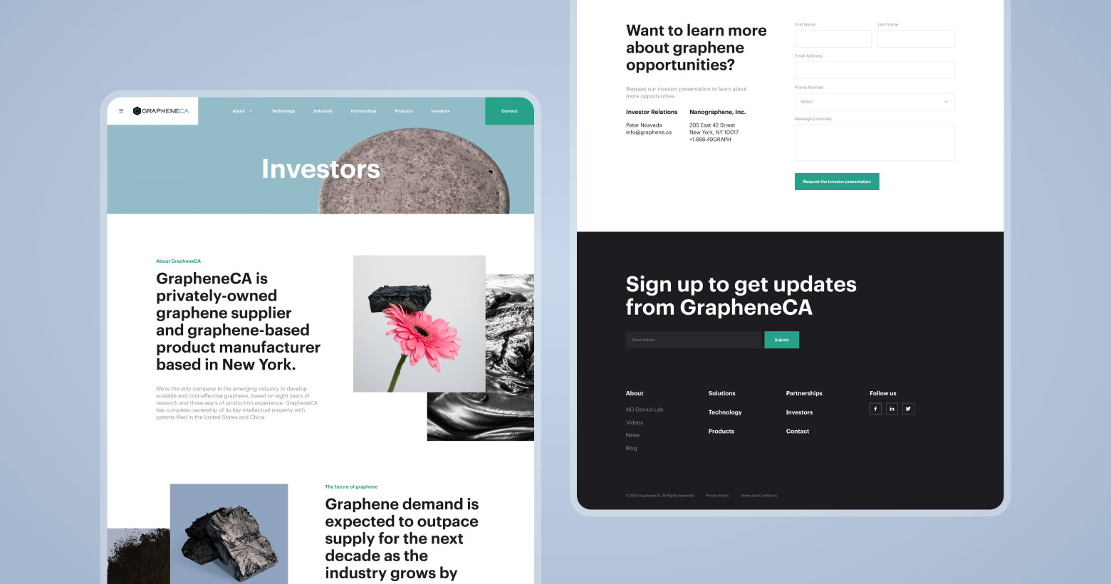
A corporate website for such a product should be both strict and light. So, we’ve combined a clean and minimal layout with detailed illustrations and strict forms.
We’ve started work on this project from the logic of the future website and user flow. After thinking about the end-user and an image of the company, we’ve proceeded to UI design.
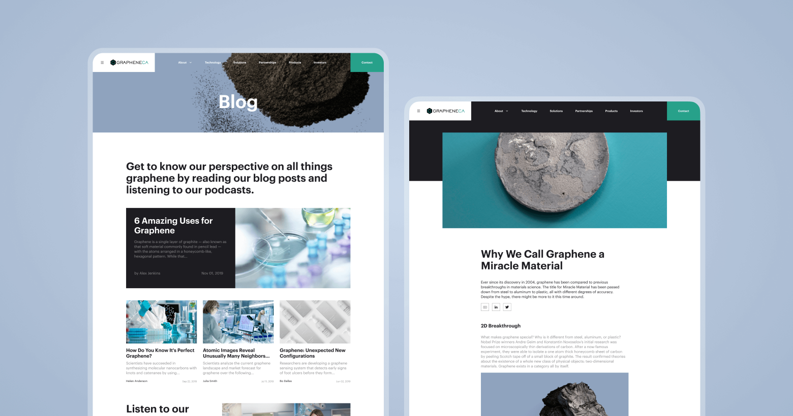
Good content is everything for the production company website. So, we’ve created a recommendation document for the photographer to make the images we require. And design started from that point.
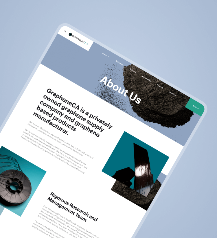
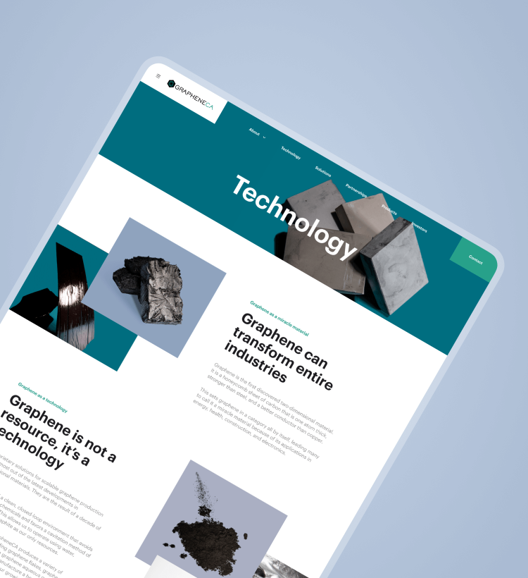
Choose the smart design for smart solutions
We designed the experience around the idea of speed and small delightful moments aimed to engage customers during their online grocery routine.
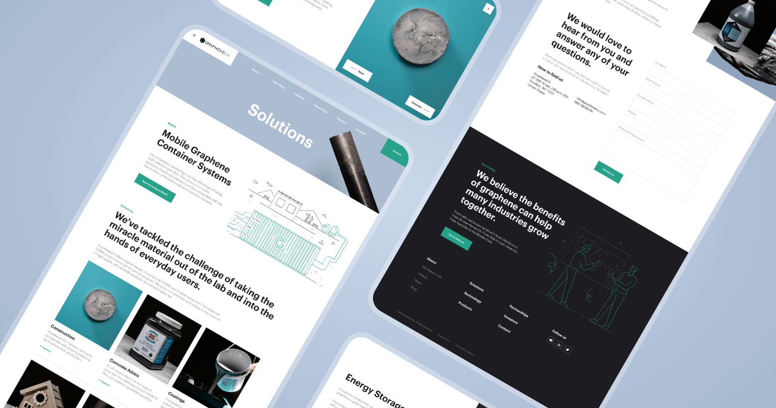
Simple forms, clean call to actions and smart idea
To engage as many users as possible to buy products on the website, we made a clean and simple layout and added bright CTA buttons.
Awesome illustrations and
perfect communication
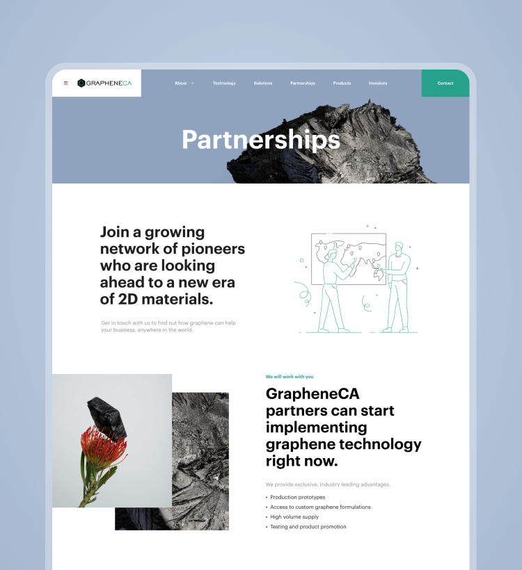
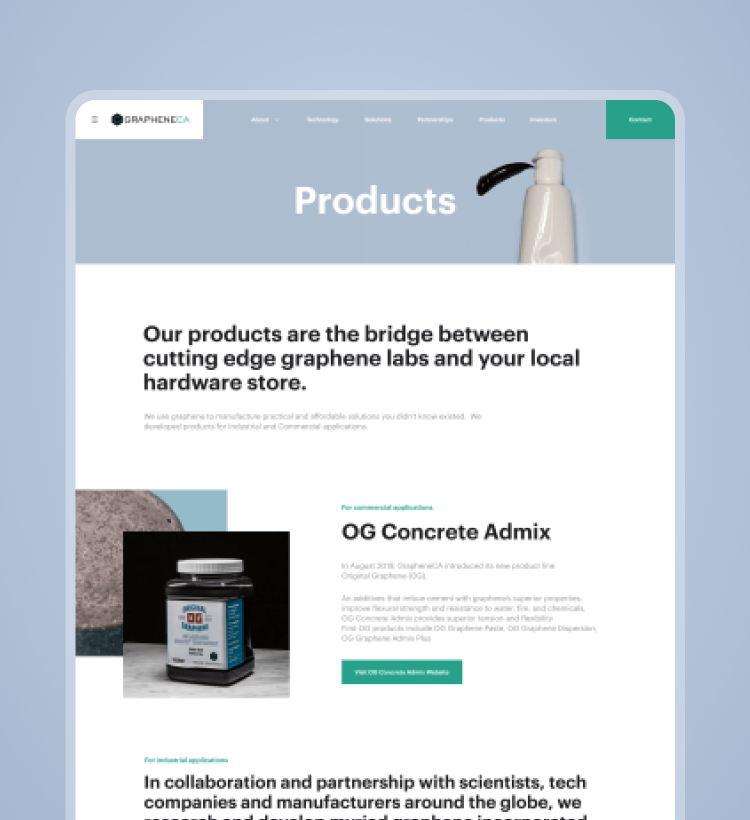
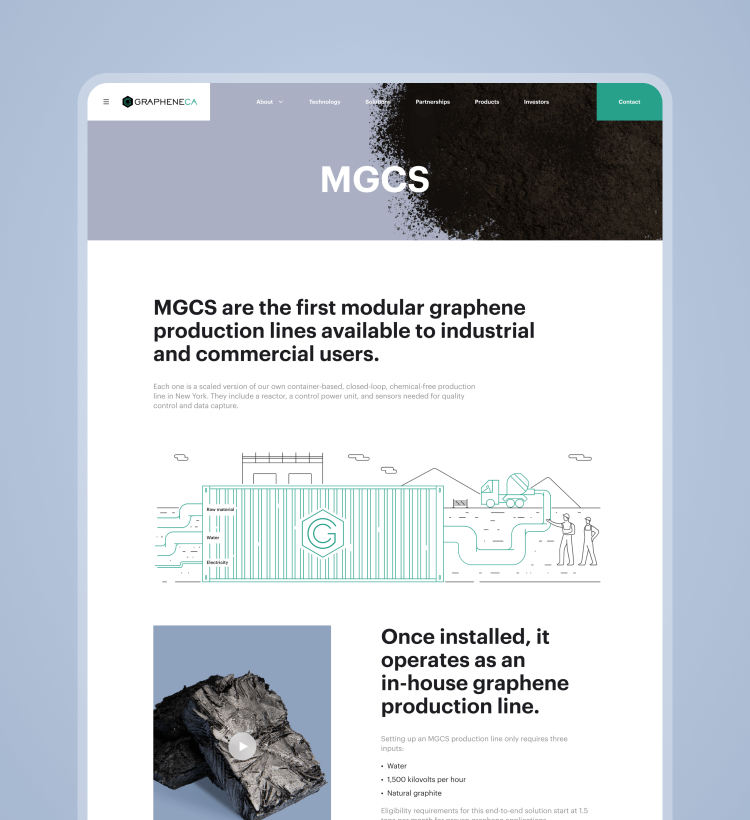
To make communication between the company and user great, we’ve added illustrations to the website.
Completely unique illustrations made by our agency can effectively share an idea with the user in blocks, where pictures are not fitting in well.
GraheneCA website looks super stylish because all the content is aligned with the design palette. Even despite a big amount of text, you can feel how is it simple — to get involved in the world of Graphene.